I wanted to develop a logo that would encompass my personal research themes (mechanical engineering, materials science, microfabrication, and the life sciences, particularly cell mechanics) and incorporate motifs from both mechanics and chemistry.
At the time, I was exploring how cells feel into their environment, a phenomenon that incorporates the full spectrum of chemomechanics: cells are sticky, attaching to their surroundings by weak chemical interactions between transmembrane proteins and the proteins of an extant or deposited extracellular matrix. Then, they reel in those connections and rely on the detected mechanical resistance to mediate behavior such as spreading, proliferation, or even apoptosis—controlled cell death—if their environment is unsuitable.
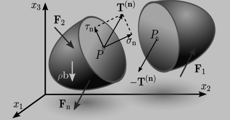
So my schematics at the time had lots of cells and lots of substrata and lots of surface traction (third image adapted from work by Rudolf Merkel’s group):
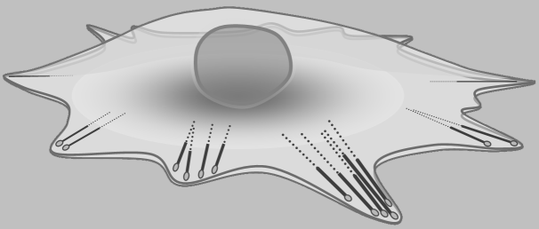
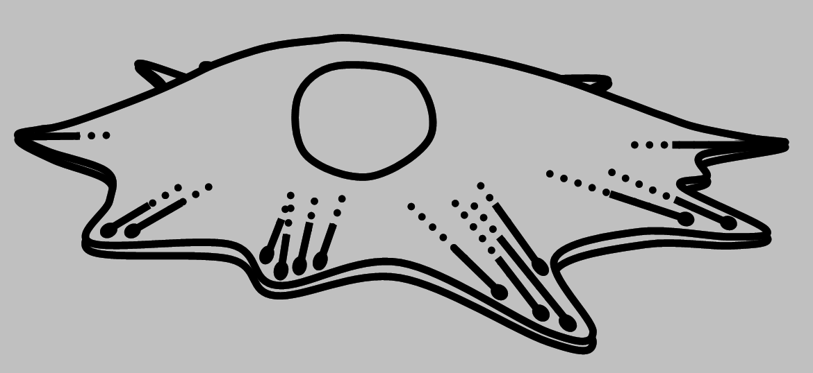
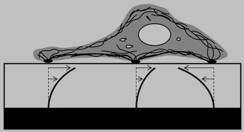

The last schematic is intended to connote the broad mechanical heterogeneity that we encounter in a cell population even when applying a single rheological method.
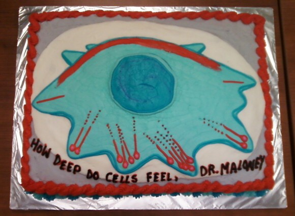
The schematic of the adherent cell and its internal actin fibers and focal adhesions seemed too specific, although it made a great post-thesis-defense cake:
It seemed natural to include arrows and a stylized material region to reflect the way that surface tractions are typically defined:

However, my first sketches probably went too far in the other direction—too minimal, too road-sign-like:
Adam Zeiger and I were working on atomic force microscopy (AFM)-enabled scanning and indentation of cells and substrata (left image by us, right by Ulrich Schwarz’s group):
So I also wanted to evoke concepts of AFM and nanoindentation along with surface traction:
Having arrows to indicate reaction forces or a dynamic process seemed important, perhaps along with a spring and dashpot to represent the extremes of mechanical response of an idealized solid and liquid, respectively:
Another key motif was the ligand-receptor bond, a key concept in chemistry:

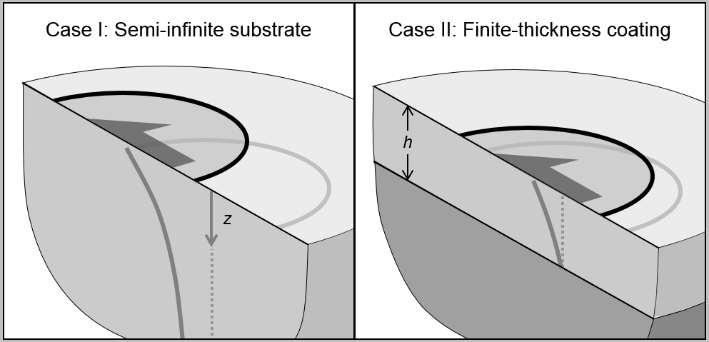
My sketches of a 3D view were intended to show a half-space or semi-infinite body under our surface experiments:
But trying to insert too many motifs made the image look too busy:
A side view was appealing because it evoked a stylized mortar and pestle, another classic icon of chemistry:
But then, self-doubt struck me: was I veering too close to a martini?
To say nothing of Van Halen:

No, no, never question your creative urges. Can we emphasize the indentation aspect in 3D?
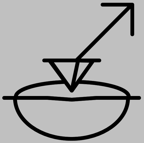
This version definitely evokes the indentation techniques (Berkovich geometry, Vickers hardness) widely used to characterize material strength and toughness:
But the composition seems to be getting weaker, not stronger. Let’s compose the side view to show both indentation and a stylized force arrow:
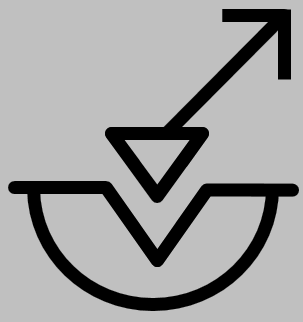
Now, is anyone getting flashbacks to the male symbol? (At the time, my office was three or four women and me. Now my office only occasionally contains only one woman, who is married to me.)

As an alternative, a circle termination resembles the ligand-receptor icon, and extending one of the line segments emphasizes the two Vs to reference my PI at the time:
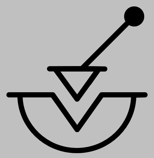
My PI also suggested adding a spring (is it a coincidence that this modification added another two Vs?) And lawn green looked great for the first t-shirt we put it on (here shown on my finest UROP, Martha Gross, who went on to work for Dave Bradwell and subsequently obtained her PhD in materials science and engineering at the University of Texas at Austin):

