Context
These notes are intended for the Simmons Mechanobiology Lab (and the group members working on the project “Measurement of Contractility-induced Residual Stress for Tissue Engineering” directed by Prof. Sarntinoranont) and their exploration of machine learning to relate Raman spectra to compliant substratum strain states.
Part 1 of these notes covers classification of linearly separable groups by maximizing the margin, transformation to achieve linear separability, Hesse normal form, the implementation of quadratic programming optimization, and equivalence to convex hulls. Part 2 covers the transition from the primal to the dual formulation, the kernel trick, and slack variables. Part 3 will address cross validation, performance metrics, the transition from support vector classification to support vector regression, and the incorporation of principal component analysis.
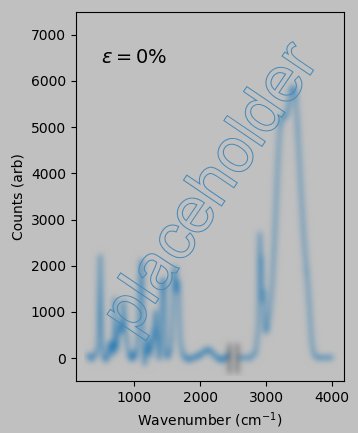
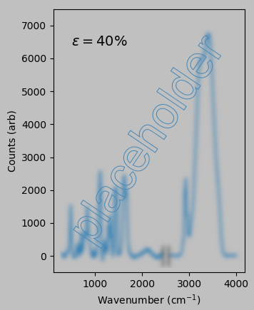
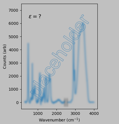
Our problem is as follows: If the following Raman spectra correspond to 0% and 40% uniaxial strain of polyacrylamide:
then what strain does the following spectrum correspond to?
Potentially, sophisticated learning and prediction techniques will ultimately be useful or necessary for this project. In the following content, I’ve tried to turn my notes—a beginner’s notes—into a tutorial relevant to the group. These notes also serve as an introduction to support vector machines for engineers getting up to speed in machine learning.
Strategy
My first aim is to clarify the ample jargon (e.g., what is a “maximum margin linear classifier”?) and general concepts of the field rather than to dive directly into the deep mathematical machinery of machine learning. Many textbooks on classification, for example, immediately introduce expressions such as $$(\boldsymbol{x_1},y_1),\ldots,(\boldsymbol{x_m},y_m)\,\exists\,\mathcal{X}\times\{\pm 1\},$$ which is easily interpreted by the mathematicians as a compact way of saying that we have a bunch of N-dimensional input observations \(\boldsymbol{x_m}\) and corresponding output labels \(y_m\) and that each pair can be classified in either the -1 or +1 groups.
However, too many such expressions might make our eyes glaze over at first attack. Therefore, these notes focus on defining terms based on our specific interests and on presenting straightforward illustrations and intuitive reasoning to cover key concepts.
For example, we might visually represent the preceding mathematical expression as follows:
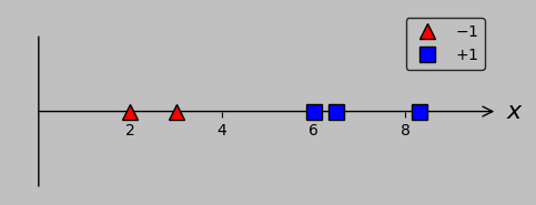
One-dimensional classification example with two groups: a couple of red triangles (corresponding to a label of -1) and three blue squares (corresponding to a label of +1). How would you separate these groups? (Plotted in Python with this code.)
Here, the individual points are each located simply by a scalar (as a simplification of the general vector \(\boldsymbol{x_m}\) that instead simply points in the \(x\) direction), and the red triangles correspond to –1 and the blue squares to +1 (representing the output labels \(y_m\)).
Specific motivation
Why would we choose to analyze Raman spectra with a support vector machine (probably preceded by principal component analysis)? I selected these tools because they’ve been found useful in multiple studies; one example is Chengxu Hu et al. “Raman spectra exploring breast tissues: Comparison of principal component analysis and support vector machine-recursive feature elimination.” Medical Physics 40.6 (2013). In addition, a quick look at the machine learning literature suggests that support vector machines are a good starting point for understanding and experimenting with artificial intelligence and that principal component analysis is well suited to reducing spectra (in which several peaks or features might change size or shape in concert) into simpler forms.
Definition of key terms
Let’s first identify what flavor of machine learning interests us.
- We can broadly divide inference efforts between classification and regression.
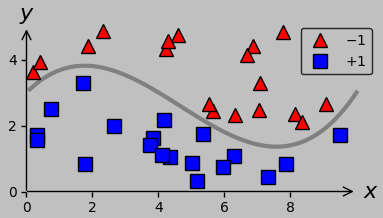
For a new data group of interest, classification (left plot below) involves predicting the appropriate associated discrete group (such as whether a certain Raman spectrum was acquired from diseased or healthy tissue); in contrast, regression (right plot below) involves predicting an appropriate associated continuous value (such as the strain state corresponding to a particular Raman spectrum).
 |
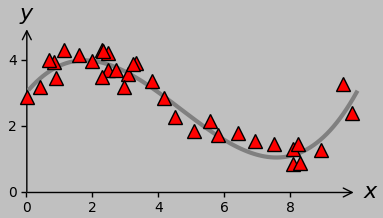 |
(Left) 2D example of classification: find the best division (gray line) between the red triangles and blue squares. (Right) 2D example of regression: find the best fit (gray line) to the red triangles.
Since we’re interested in predicting quantitative strain values from a Raman spectrum, we’re interested in regression. Most machine learning texts address classification first, then regression; in these notes as well, I’ll start with classification and continue to refer to relevant classification scenarios when they provide a useful context to define concepts and terms. For example, parts 1 and 2 of these notes are concerned entirely with classification.
In addition, let’s note that we’re engaged in supervised learning: each data input (and inputs are also sometimes called instances, cases, patterns or observations) matches a data output (and outputs are sometimes called labels, targets, or—here also—observations).
In the plots above, the input and output for the classification data are the 2D position and the classification of –1/+1, respectively; the input and output for the regression data are the \(x\) and \(y\) coordinates, respectively. In our actual problem, of course, the input is a Raman spectrum, and the output is a strain state such as the magnitude of the uniaxial stretch.
In brief, supervised learning means that we seek a function that, given an input, returns the correct output.
(Unsupervised learning, in contrast, doesn’t involve learning from labeled output data; one example is clustering.)
For both classification and regression tasks, it’s often the case that we have input-output pairs that are already known; in our case, these pairs are the applied strain states and corresponding collected Raman spectra. These data are called the training data. (Actually, for quality control and to optimize the system, we might take just a portion of these data as the training data, using the rest as validation data to test our learning process when we still know the correct output “answer.”)
In any case, sometimes we’ll know the output (and we’ll use this information to refine our classification or regression process), and sometimes we won’t (and we’ll want to use our refined process to infer new conclusions). The latter case (and one of the key deliverables of this research project) involves recording Raman spectra via optically interrogating regions around contractile cells on synthetic compliant substrata or in tissue.
Finally, we’re performing batch learning: in the learning process, all data are supplied to the algorithm at once; the learning does not occur in stages (at least that’s not what we anticipate at this stage).
These terms help us put our desired analysis method in context, which is particularly valuable when surveying the literature through an online search: we seek a regression method that implements supervised batch learning. We anticipate providing training data (to build one or more model) and validation data (to evaluate and compare the models) in the form of input-output pairs. We expect to then apply the best trained model to obtain new inferential results from input data whose corresponding output data are unknown.
1D classification example: Intuitive approach
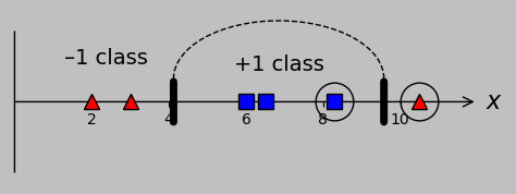
To launch our machine learning adventure, let’s return to the simple classification problem displayed above. In this example, single scalar values are plotted in 1D, and the actual classes are non-overlapping (i.e., we can classify all points correctly using a single division, with no error; another term for this feature is linear separability). Here, we wish to divide the group of red triangles (lying at \(x\) coordinates 2 and 3) from the group of blue squares (lying at coordinates 6, 6.5, and 8.3):
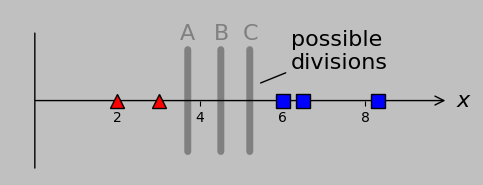
Our 1D example classification model, where the red triangles can be perfectly separated from the blue squares by a single threshold value. Candidate divisions are A, B, and C; perhaps we intuit that B, lying at the midpoint of the smallest distance separating the two groups—the middle of the street, in effect—is the optimal choice.
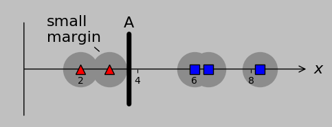
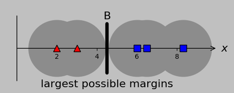
Well, we could assign a division at A, B, or C with absolute success, and out of these options, B is special because it lies at the midpoint of the gap and therefore maximizes the margin on either side. That is, if future data that we encountered included data closer to the opposing group, then a centered division point would probably be best situated to accommodate this variation:
(a)
(b)
Gray circles behind each input point represent the maximum potential error that can be accommodated by a certain division. Division A is less accommodating (and therefore more likely to misclassify additional data) than division B; equivalently, we say that B is better at maximizing the margins.
The result of this intuitive strategy is called the maximum margin linear classifier, just to give an example of the terms that seem painfully opaque until we develop them in easy-to-understand stages.
1D classification example: Developing a systematic approach
For our 1D data, let’s call the specific value of the selected division point (equivalently, the threshold or boundary condition) \(a\). We intuitively chose a threshold of \(a=4.5\) (i.e., line B, which lies midway between points at 3 and 6), representing the midpoint between the farthest-right red triangle and the farthest-left blue square, which are circled below.
We arrive at an important point: the position of the maximum margin linear classifier depends only on those circled points (vectors in the N-dimensional case). (The positions of the other points/vectors aren’t important except inasmuch as they are correctly classified.) Because these key vectors provide the foundation for the classification procedure—they support classification—they are termed support vectors:
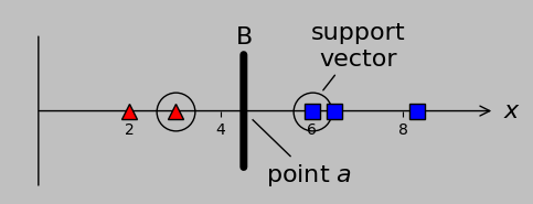
When we divide non-overlapping classes, only the inputs nearest the division point are relevant and are designated support vectors because of their importance. Other inputs—as long as they are correctly classified—simply don’t matter.
Wow, we can now consider ourselves to be performing support vector classification with very little conceptual burden. The key point to remember is that the support vectors predominate in determining the position of the separating classifier.
Now, one way to classify a new data point \(x\) would be to check whether it’s greater than or less than \(a\): do we have \(x\lt a\), or do we have \(x\gt a\)?
But an alternate approach, well suited for classifications comprising –1 and +1, would be to simply calculate the sign of \(x-a\), or \(\mathrm{sgn}(x-a)\). Note that this approach gives the classification (of –1 or +1) automatically, which is convenient. In fact, the sign of any positive multiple of \((x-a)\) would work, corresponding to different lines (hyperplanes in the N-dimensional case) passing through the division point. We could write the hyperplane equation as \(y=w(x-a)\), for example, for positive \(w\):
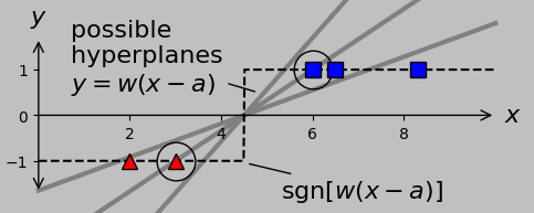
The sign function facilitates automatic classification of input values. Shown in gray are three candidate hyperplanes that all correctly classify the two groups once the sign function is applied; the dashed black line shows
their common predictive output.
Notably, only one hyperplane passes through the support vectors, and this special hyperplane is called the canonical or optimal hyperplane:
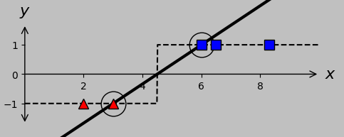
The canonical hyperplane (black line) satisfies the correct classification result of –1 and +1 exactly at the support vectors. We seek a way to calculate the details of this hyperplane automatically.
Up to this point, we’ve used intuition to maximize the margin between groups. Let’s now try working backward: taking a clue from the canonical hyperplane shown above, let’s require that our separator satisfies \(w(x_m-a)\le -1\) for every red triangle (classification \(y_m=-1\)) and \(w(x_m-a)\ge 1\) for every blue square (classification \(y_m=1\)). Hey, wait a second, it’s more efficient to write simply \(w(x_m-a)y_m\ge 1\), which applies to all points. So that’s clever.
(Here, \(x_m\) and \(y_m\) refer to the specific data points; numbering them from left to right, we’d designate the red triangles as \(x_1\) and \(x_2\) and the blue squares as \(x_3\), \(x_4\), and \(x_5\), so that the input data are \((x_m,y_m)=((2,-1),(3,-1),(6,1),(6.5,1),(8.3,1))\). Clear?)
Check out which hyperplanes satisfy this requirement for divisions A, B, and C:
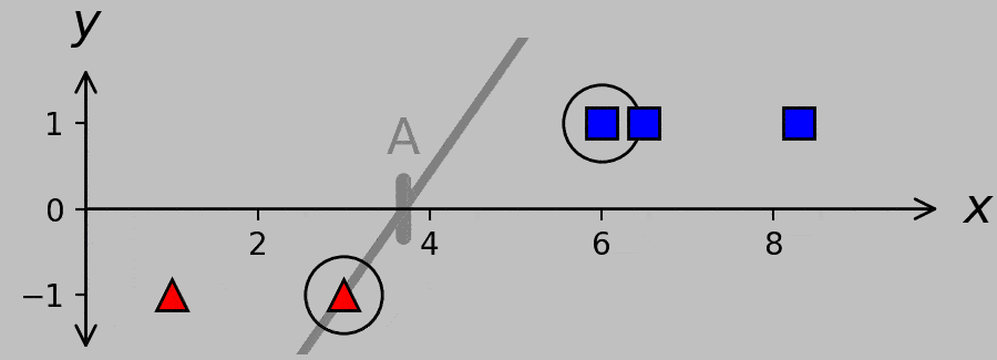
Hyperplanes for divisions A, B, and C. A systematic way to obtain the canonical hyperplane (shown in black) is to ask which hyperplane exhibits the minimum slope while satisfying the necessary classification criterion \(w(x_m-a)y_m\ge 1\). (Plotted in Python with this code.)
Expressed in words, we’re requiring not only that the sign of the hyperplane predicts the correct classification but also that the hyperplane never undercuts the support vectors. For example, the hyperplane corresponding to division A is constrained to pass through the far-right red triangle, and the hyperplane corresponding to division C is constrained to pass through the far-left blue square. Note that the slope of the hyperplane is lower when it passes through the optimal division B than when it passes through the inferior divisions at A and C; furthermore, note that the B hyperplane passes through both support vectors.
So we’ve found (in 1D for the linearly separable case, at least) that minimizing \(w\) while satisfying \(w(x_m-a)y_m\ge 1\) works as a rigorous way to find the maximum margin linear classifier. It turns out that this aspect still holds when we extend the situation to 2D and higher: we’ll still seek to minimize the effective slope \(w\) of the hyperplane while never undercutting a support vector.
Let’s now consider the complication of input points unavoidably lying on the “wrong side” of the division or threshold, which will force us to extend the 1D case to higher dimensions.
Accommodating overlapping classes through transformation
We’ve seen that non-overlapping classes (equivalently, linearly separable classes) in 1D are relatively straightforward to work with because the general position of the divider is intuitive; perfect classification is assured. But what if the classes are overlapping? For overlapping classes, we have at least two approaches at our disposal: we can transform the data to be non-overlapping, or we can accommodate the misclassification through so-called slack variables (to be covered in part 2).
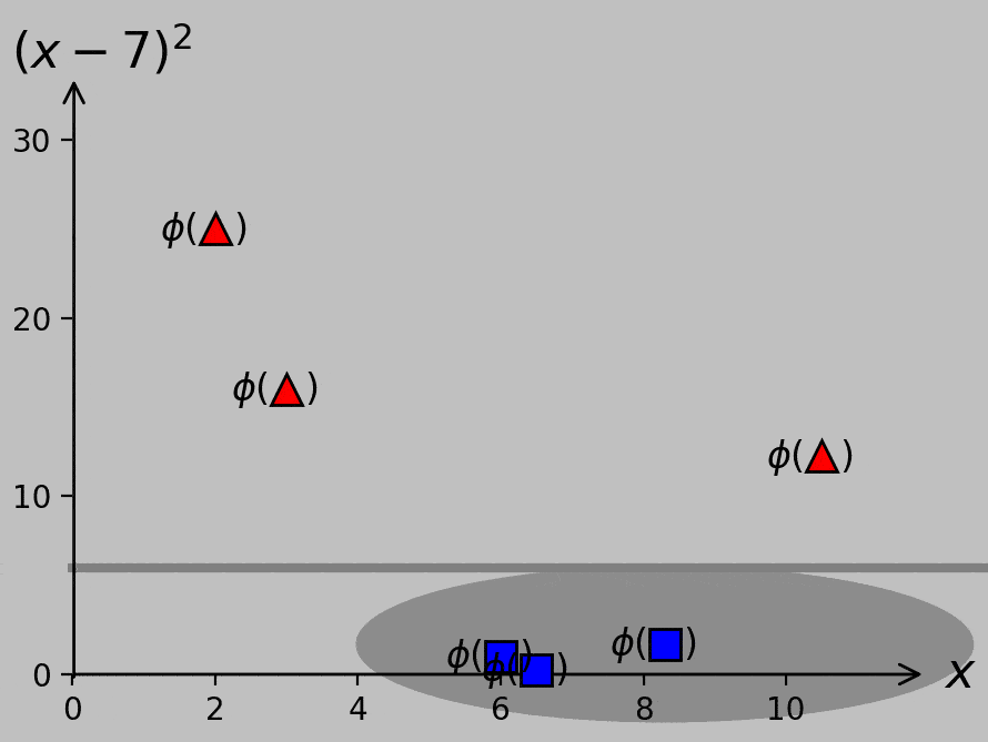
As an example of transformation, consider the following input data, which extends our existing data set by adding another red triangle on the right at \(x=10.5\):
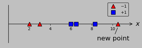
An additional data point on the “wrong side” removes the feature of linear separability, forcing us to look for other solutions.
The presence of this new data point in the “–1” class precludes error-free classification from a simple single threshold. Notably, however, we could plot the data in a higher-dimensional space in which the \(x\)-axis still plots \(x\) and a second axis plots, say, \((x-7)^2\). Let’s call this transformation \(\phi\); whereas we once plotted \(x_m\) on a 1D \(x\)-axis, we now plot the vectors \(\boldsymbol{x_m}=\phi(x_m)=\left(x_m,(x_m-7)^2\right)\) on a 2D plane:
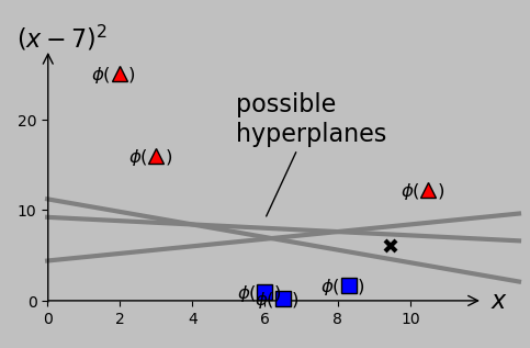
To separate the –1 and +1 classes, we could transform our original scalar \(x\) data to the corresponding \(\phi(x)\) data that are actually separable. This process is as simple as adding a second axis that plots \((x-7)^2\), which is chosen simply by eye in this case. Gray lines represent potential hyperplanes, or decision criteria, that correctly classify the now linearly separable data. The choice of hyperplane affects the classification of a potential future data point ×, so we really should decide how and what it means to optimize this process.
Linear separability returns! (At the cost of some additional mathematical machinery.)
This technique is remarkable, no? It suggests that with a suitably customized transformation, we could accommodate any additional data points that would hinder making a decision in the original space. (For the 1D case at least, this process is as simple as applying some type of polynomial transformation and plotting the results on a second axis. For the N-dimensional case, we could imagine using some sufficiently sophisticated function.)
The process of specifying such a transformation has been likened to having the data points distributed across a bedsheet and flicking the sheet in such a way that the different classes are now successfully separated. And one could imagine that a sufficiently complex flicking process could separate any collection of intermixed data. (But is our transformation needlessly complex to accommodate the details of the training data, without necessarily fitting the subsequent data successfully? This will be a topic of interest later when we discuss overfitting.)
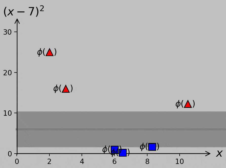
Of course, it’s true we don’t know yet what slope and position we should use for the optimal decision line or hyperplane (except inasmuch as we can expect that we should maximize the margin, as before). And the choice of hyperplane has consequences; our decision would govern how we classify the new point shown as × above, for example. Here are two ways to visualize the margin provided by various slopes and positions of sample hyperplanes:
Classifier margin for various hyperplane slopes and positions. Left: minimum margin shown as a circular region of safety for the point most susceptible to misclassification. Right: minimum margin shown as a bound on either side of the hyperplane, where the gray strip can be thought of as a street between the classes. Larger margins—larger streets—are always preferred.
In 2D or higher, we could start by selecting the midpoint between the two closest points (which worked well in the 1D case), but it’s not necessarily clear yet how to set the slope to avoid passing close to—or worse, misclassifying—other points. So we’ll need some mathematical guidance for choosing the best hyperplane parameters, and that guidance will involve extending our optimization rules. This aspect is discussed in the next section.
Formulating the classification problem in 2D and higher
Let’s take a moment to summarize. I hope that both the intuitive approach (maximize the margin) and the corresponding optimization algorithm (minimize \(w\) while satisfying \(w(x_m-a)y_m\ge 1\)) appear straightforward for non-overlapping scalar groups that can be plotted on a line. To generalize this approach to (potentially overlapping) groups of vectors in N-dimensional space, we first need to review some geometrical concepts.
Geometrical considerations, including the introduction of Hesse formThis discussion of how a support vector machine operates is necessarily going to include some geometry-intensive considerations; for example, we’ll need to address the distance between a point and a hyperplane in N-dimensional space.
We’re likely familiar with expressing a line in the form of \(y=mx+c\) (or whatever parameters we’re familiar with; note that the slope \(m\) is distinct from the index (\(_m\)) that we’ve been using to number the inputs). Here, \(x\) and \(y\) are plotted on the horizontal and vertical axes, respectively; \(m\) is the slope, or rise over run; and \(c\) is the \(y\) intercept. In the standard plot, the \(x\)-axis presents the independent variable (i.e., the one we can change), and the \(y\)-axis presents the dependent variable (i.e., the one we wish to understand). In materials science, for example, we might plot an alloy’s yield strength (\(y\)-axis) as a function of its temperature (\(x\)-axis). Or the stiffness of a hydrogel as a function of the surrounding salinity.
Consider our classification problem with points in 2D space and a line that we wish to choose to maximize the margin. Each set of points (which can also be thought of as vectors extending from the origin) now represents a set of input data to be classified in terms of a certain output. For example, we might wish to consider the temperature and pressure before classifying a solid-state phase as thermodynamically stable or not.
With the 2D points that arise in a classification problem, we don’t really have dependent and independent axes; in our thermodynamic stability example, for instance, we should be able to swap the temperature and pressure axes without affecting the results. So instead of \(x\) and \(y\), let’s use \(x_1\) and \(x_2\). And let’s bring the variables over to one side to obtain the line equation \(mx_1-x_2+b=0\). This form is more symmetric and therefore more appropriate for our N-dimensional inputs that all have equal importance a priori.
Notably, we can rewrite this equation \(mx_1-x_2+b=0\) as \(\boldsymbol{w}\cdot\boldsymbol{x}+c=0\), where \(\boldsymbol{w}=(m,-1)\) and where \(\boldsymbol{x}\) is the vector pointing from the origin to a certain point; here, we’ve employed the dot product \(\boldsymbol{w}\cdot\boldsymbol{x}=w_1x_1+w_2x_2\). This form is known as Hesse form.
Equivalently, we could write \(\boldsymbol{w}\cdot\boldsymbol{x}=\boldsymbol{w}^\mathsf{T}\boldsymbol{x}\), where all vectors are expressed in column form and \(\mathsf{T}\) represents the matrix transpose; here, we’re performing matrix multiplication with vectors. (Still another equivalent representation is \(\langle\boldsymbol{w},\boldsymbol{x}\rangle\), where \(\langle\cdot{,}\cdot\rangle\) is called the inner product or scalar product, but we’ll stick to the dot notation and the transpose notation. In part 2, another equivalent representation appears: \(\sum_m w_m x_m\), termed index notation.)
The reverse is also possible: given an equation in Hesse form \(\boldsymbol{w}\cdot\boldsymbol{x}+b=0\), or (in 2D) \(w_1x_1+w_2x_2+b=0\), we can easily determine that \(x_2=-\left(\frac{w_1}{w_2}\right)x_1-\frac{b}{w_2}\), which if plotted on an \(x_1\) vs. \(x_2\) Cartesian space corresponds to a line with slope \(m=-\frac{w_1}{w_2}\) and \(y\) intercept \(c=-\frac{b}{w_2}\). OK.
Now, I should say at this point that I find this shift to Hesse form very disconcerting regardless of how casually it’s applied in support vector machine texts. Most texts and tutorials, even at the beginner level, simply state something like "We seek a hyperplane equation with input weights \(\boldsymbol{w}\) [these components are often called weights] and bias \(b\) that satisfies…" It’s easy to get stuck on such framing because the Hesse form involves a locus of points composing the hyperplane. Here, we’re no longer calculating a certain \(y\) from a given \(x\) (which is straightforward) but rather seeking some amorphous group of points that satisfies the condition of the left-hand side equaling zero. So why is it that we use this formulation? Here are some of the key reasons:
With all variables brought to one side, we attain symmetry; no one type of input is privileged over another.
In addition, the dot product lets us apply all the machinery of linear algebra to an arbitrary number of N-dimensional inputs, expressed as \(\boldsymbol{x_m}\), each with a corresponding classification \(y_m\). If you've ever taken a class on linear algebra, you might recall how some of this machinery provides the ability to solve many equations simultaneously.
Another neat aspect is that \(\boldsymbol{w}\) is normal (i.e., perpendicular) to our hyperplane. This condition is useful because we’ll be relying strongly on perpendicular distances when maximizing margins.
Algebraic expressions are readily available for calculating distances in terms of normal vectors to a plane. For example, it’s useful to know that the distance \(d\) between a point \(\boldsymbol{x_m}\) and a hyperplane \(\boldsymbol{w}\cdot\boldsymbol{x}+b=0\) is \(d=\frac{|\boldsymbol{w}\cdot\boldsymbol{x_m}+b|}{||\boldsymbol{w}||}\), where \(||\boldsymbol{w}||=\sqrt{\boldsymbol{w}\cdot\boldsymbol{w}}=\sqrt{\boldsymbol{w}^\mathsf{T}\boldsymbol{w}}\) is the length—also called the norm—of the vector \(\boldsymbol{w}\).
Similar to the 1D case where we sought to satisfy \(w(x_m-a)y_m\ge 1\), we now seek to satisfy (by analogy) \((\boldsymbol{w}\cdot\boldsymbol{x_m}+b)y_m\ge 1\) (so \(w\) and \(a\) get slightly shuffled into \(\boldsymbol{w}\) and \(b\), but the general idea stays the same, with the key difference being that the scalar \(w\) changes to the vector \(\boldsymbol{w}\)). We might compress this expression further by defining the augmented hyperplane and vectors \(\boldsymbol{\hat{w}}=(b,w_1,w_2,\dots,w_m)\) and \(\boldsymbol{\hat{x}_m}=(1,x_1,x_2,\dots,x_m)\), respectively, prepending \(b\) to \(\boldsymbol{\hat{w}}\) and \(1\) to \(\boldsymbol{\hat{x}_m}\) to give \((\boldsymbol{\hat{w}}\cdot\boldsymbol{\hat{x}_m})y_m\ge 1\) as a compact criterion for correct classification. Try implementing this dot product to confirm that the results are the same as before.
These reasons provide ample motivation for getting used to Hesse form, dot products, the matrix transpose, and the other machinery of linear algebra!
We now generalize to the 2D case and beyond. As described for the 1D case and in the box above, we require the hyperplane to not undercut any support vectors; therefore, we require \((\boldsymbol{w}\cdot\boldsymbol{x_m}+b)y_m\ge 1\). In addition, we seek to maximize the margin. In the 1D case, this aspect was as simple as minimizing the slope \(w\) of the line that acted as the hyperplane. What about the case of higher dimensions? Well, we already identified a formula for the distance from a point to a hyperplane in the box above, so let’s maximize the distances from the hyperplane \(\boldsymbol{w}\cdot\boldsymbol{x_m}+b=0\) to the points to be classified.
Using the distance formula introduced in the box above, we can say that we wish to maximize $$d=\frac{|\boldsymbol{w}\cdot\boldsymbol{x_m}+b|}{||\boldsymbol{w}||}.$$
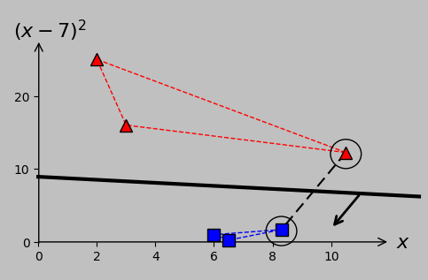
Shown below is the distance from the arbitrary input point \(\boldsymbol{x_2}\) to a candidate hyperplane, for example (the \(\phi\) notation is omitted for clarity from here on, but don’t forget that the original \(x_m\) points were \(\phi\)-transformed to achieve linear separability):
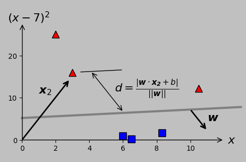
Distance between an example point (here, the second point in the –1 class, or \(\boldsymbol{x_2}\)) and a candidate hyperplane (shown in gray and characterized by its normal vector \(\boldsymbol{w}\)). Caution: when the axes are scaled differently (equivalently, when the plotting aspect ratio does not equal one), orthogonal vectors don’t appear perpendicular; nevertheless, both \(\boldsymbol{w}\) and the distance measurement are definitely orthogonal to the hyperplane.
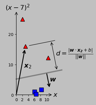
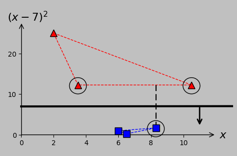
The corresponding plot with an aspect ratio of one, now with orthogonal vectors appearing perpendicular.
More precisely, we wish to maximize the minimum distance across the groups of data points for each classification. In this case, we see that \(d\) for \(\boldsymbol{x_2}\) is larger than that for \(\boldsymbol{x_6}\); therefore, point \(\boldsymbol{x_6}\) is more important for this particular hyperplane slope and intercept. Of course, for a different slope and intercept, point \(\boldsymbol{x_2}\) might predominate. It’s this type of iterative decision making that we seek to automate and delegate to the computer to implement accurately and consistently.
(A side note: At the risk of causing confusion, the former figure continues the trend of scaling the \(y\)-axis to suitably fit within the available space; as a result, orthogonal entities such as the hyperplane and its normal vector \(\boldsymbol{w}\) don’t appear perpendicular. This weirdness tripped me up for several hours as I worked on these figures until I remembered that scaling an axis keeps parallel lines parallel but does not necessarily keep perpendicular lines perpendicular. I’m sticking with this presentation to emphasize this aspect to the reader—after all, we’ll frequently encounter or employ plots with a plotting aspect ratio other than one, and we shouldn’t be stymied by this result. The weight vector \(\boldsymbol{w}\) is, as always, orthogonal to the hyperplane and parallel to the distance over which \(d\) is measured. See the latter figure, which plots the axes with equal scaling, in case this aspect is confusing.)
Back to the distance calculation. We already know that at the support vectors, the classification inequality turns into the equality \(|\boldsymbol{w}\cdot\boldsymbol{x_m}+b|=1\), as in the 1D case where the optimal (black) line predicted exactly –1 or 1 at the support vectors. Therefore, the numerator simplifies to 1 at the support vectors (which have yet to be determined rigorously), and we seek simply to maximize \(\frac{2}{||\boldsymbol{w}||}\) (the factor of 2 arises because the margin is \(\frac{1}{||\boldsymbol{w}||}\) on either side of the hyperplane) or equivalently to minimize \(\frac{1}{2}||\boldsymbol{w}||=\frac{1}{2}\sqrt{\boldsymbol{w}^\mathsf{T}\boldsymbol{w}}\) or half the length of the vector \(\boldsymbol{w}\), which is very similar to minimizing the scalar \(w\) in the 1D case. For convenience, we might instead choose to minimize \(\frac{1}{2}||\boldsymbol{w}||^2=\frac{1}{2}\boldsymbol{w}^\mathsf{T}\boldsymbol{w}\)—squaring the length won’t have any effect in a minimization problem and conveniently avoids the square root. The outcome of this constrained optimization, as we hoped to achieve, is the canonical hyperplane with maximum margin.
Reiterating, our problem can be stated as follows:
$$\mathrm{minimize~}\frac{1}{2}||\boldsymbol{w}||^2=\frac{1}{2}\boldsymbol{w}^\mathsf{T}\boldsymbol{w},$$ $$\mathrm{subject~to~}(\boldsymbol{w}\cdot\boldsymbol{x_m}+b)y_m\ge 1\mathrm{~(or,~equivalently,~}(\boldsymbol{\hat{w}}\cdot\boldsymbol{\hat{x}_m})y_m\ge 1\mathrm{)}.$$
This is a so-called quadratic programming optimization problem, for which several open-source solvers are available. (Because of the quadratic nature, we advantageously avoid the possibility of becoming trapped in non-global minima. The operational details of such solvers are outside the scope of this note.) For example, the qpsolvers package in Python, implemented as linked below, can accommodate this problem. This package satisfies the following conditions:
$$\mathrm{minimize~}\frac{1}{2}\boldsymbol{u}^\mathsf{T}\boldsymbol{Pu}+\boldsymbol{q}^\mathsf{T}\boldsymbol{u},$$
$$\mathrm{subject~to~}\boldsymbol{Gu}\le\boldsymbol{h}.$$
Careful inspection reveals that if we take \(\boldsymbol{u}\) as \(\boldsymbol{\hat{w}}\), then \(\boldsymbol{P}\) should be the identity matrix with the (1,1) element set to zero (to remove \(b\)), that \(\boldsymbol{q}=0\), that the signs of \(\boldsymbol{G}\) and \(\boldsymbol{h}\) need to be flipped because the inequality is the reverse of what we want, and that we must carefully assemble \(\boldsymbol{G}\) from our knowledge of \(\boldsymbol{x_m}\)—where the input data were transformed in this case, so \(\boldsymbol{x_m}=\phi(x_m)=(x_m,(x_m-7)^2)\)—and \(y_m\). That’s all there is to it!
Recall that our input data are $$(x_m,y_m)=((2,-1),(3,-1),(6,1),(6.5,1),(8.3,1),(10.5,-1)),$$ which we transformed to $$(\boldsymbol{x_m},y_m)=(((2,25),-1),((3,16),-1),((6,1),1),\\((6.5,0.25),1),((8.3,1.69),1),((10.5,12.25),-1))$$ to achieve linear separability. In equation form, we therefore have
$$\boldsymbol{\hat{w}}=\begin{bmatrix}b \\ w_1\\w_2\end{bmatrix},$$
$$\boldsymbol{P}=\begin{bmatrix}0 & 0 & 0\\0 & 1 & 0\\0 & 0 & 1\end{bmatrix},$$
$$\boldsymbol{q}=\begin{bmatrix}0 \\0 \\0 \end{bmatrix},$$
$$\boldsymbol{G}=-\begin{bmatrix}-1 & -2 & -25 \\ -1 & -3 & -16 \\1 & 6 & 1 \\1 & 6.5 & 0.25\\
1 & 8.3 & 1.69 \\ -1 & -10.5 & -12.25\end{bmatrix},$$
$$\boldsymbol{h}=-\begin{bmatrix}1 \\1 \\1\\1\\1\\1 \end{bmatrix}.$$
Take care to understand how matrix \(\boldsymbol{G}\) is constructed to satisfy the inequality constraint.
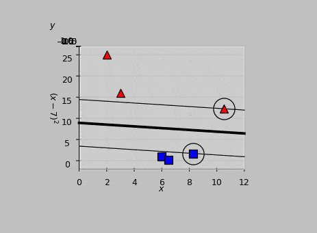
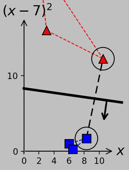
Implementing this code in Python, we obtain a solution of \(\boldsymbol{\hat{w}}=[b,\,w_1,\,w_2]=[1.64,\,-0.038,\,-0.182]\), corresponding to the following hyperplane:
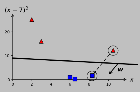
Optimal hyperplane for our transformed data as calculated via quadratic programming optimization. The margin on either side of the line is \(1/||\boldsymbol{w}||\) (here, 5.39); no larger total value is possible. The \(x\) intercept lies at \(-b/w_1\), and the \(y\) intercept lies at \(-b/w_2\). The support vectors are circled; they’re the points that exactly satisfy \((\boldsymbol{\hat{w}}\cdot\boldsymbol{\hat{x}_m})y_m=1\). The dashed line and normal vector \(\boldsymbol{w}\) are both orthogonal to the hyperplane (but not perpendicular in this plot because of axis scaling).
Calculating \((\boldsymbol{\hat{w}}\cdot\boldsymbol{\hat{x}_m})y_m\) for each vector \(\boldsymbol{x_m}\), we find that \(\boldsymbol{x_5}\) and \(\boldsymbol{x_6}\) give outputs of exactly 1, therefore identifying them as the support vectors, shown encircled in the following animation:
Animated view of the optimal hyperplane, which meets the support vectors at the classification results of \(y=-1\) and \(y=1\).
If we were to undo our transformation from 2D back to 1D, we’d find that the hyperplane reduces to two division points that perfectly classify our input data:
A single linear separator in 2D reduces in this case to two boundaries that correctly classify the overlapping 1D data.
Great—we’re now in good shape to analyze linearly separable data in N-dimensional space in general. Of course, we don’t yet know how to design a particular transformation \(\phi\) to best accommodate overlapping data. For example, recall that I arbitrarily chose \(\phi(x)=(x,(x-7)^2)\) to push the red and blue points well away from each other; however, the classifier that maximized the margins in two dimensions fails to evenly split the spaces between the classes in the 1D representation shown above. Nevertheless, we’re making progress.
To provide additional insight, here's another way of looking at the problem:
Equivalence to convex hullsIf you’re especially visually intuitive, you may have discerned that the hyperplane optimization problem in N-dimensional space is equivalent to maximizing the distance between the hyperplane and the convex hull of each class. For instance, here are the associated convex hulls and distances for our problem:
The margin maximization problem for the N-dimensional case is equivalent to identifying the midpoint between the convex hulls between the two classes. Convex hulls are shown in dashed lines according to each class color, and the shortest distance appears as the black dashed line.
This strategy clarifies how to proceed in cases where there are multiple support vectors in a single class. If one of our red triangles were moved from \((3,16)\) to \((3.5,12.25)\), for example, then it would join the red triangle at \((10.5,12.25)\) in the list of the support vectors, and the maximized margin would be the distance between the hyperplane and any position on the adjacent convex hull segment:
As \(x_2\) is increased, its transformed point in \((x_1,x_2)\) space ultimately impinges on the existing margin and therefore becomes a support vector that needs to be considered during hyperplane determination. The relevant margin now extends from one support vector to a segment between two support vectors.
If we further move the \(x_2\) point from 3.5 to 3.8, for example, we actually end up with four support vectors because the changing hyperplane slope makes \(x_3\) relevant. (Try verifying this condition using the Python code linked above.) Consider the variety of support vector groups and margin directions and distances that arise as \(x_2\) moves from 3 to 5.5 and back, now plotted with equal axis scaling to emphasize certain parallel and perpendicular relationships:
Part 1 ends here. Part 2 addresses the transition from the primal to the dual formulation, the kernel trick, and slack variables. Part 3 will address cross validation, evaluation metrics, the transition from support vector classification to support vector regression, and the incorporation of principal component analysis.
|